

24hr Redesign: ShopBack Website
24hr Redesign: ShopBack Website
Cashback presented differently in 24hrs

If you’re in the Asia-Pacific region, then chances are you might have heard of ShopBack (SB). SB is an e-commerce website that works by giving customers a percentage of their purchase money each time they make a transaction with its partner merchants through its website. Merchants do not have to pay to get listed with SB but only need to pay a cut to the site if customers buy something from them.
You can read more about them here.
Since I am not affiliated with SB in any way, I have no data to prove whether users complete the entire shopping cycle more on the website or the app. For the sake of this 24hr sprint visual design case study, we are going to focus just on the website.
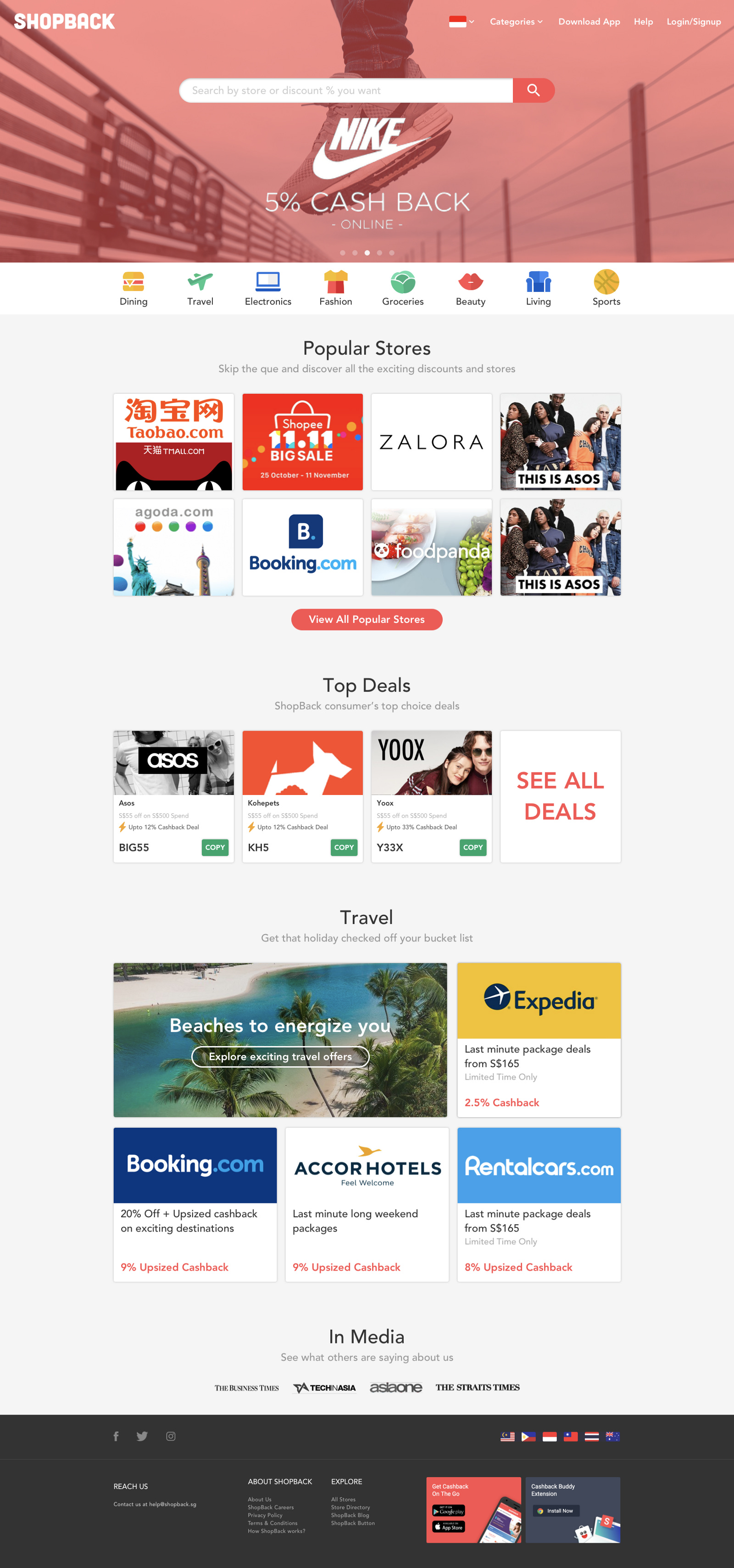
Website Structure — Breakdown
I took the screengrab of the entire website.
This allowed me to see the website at a glance.
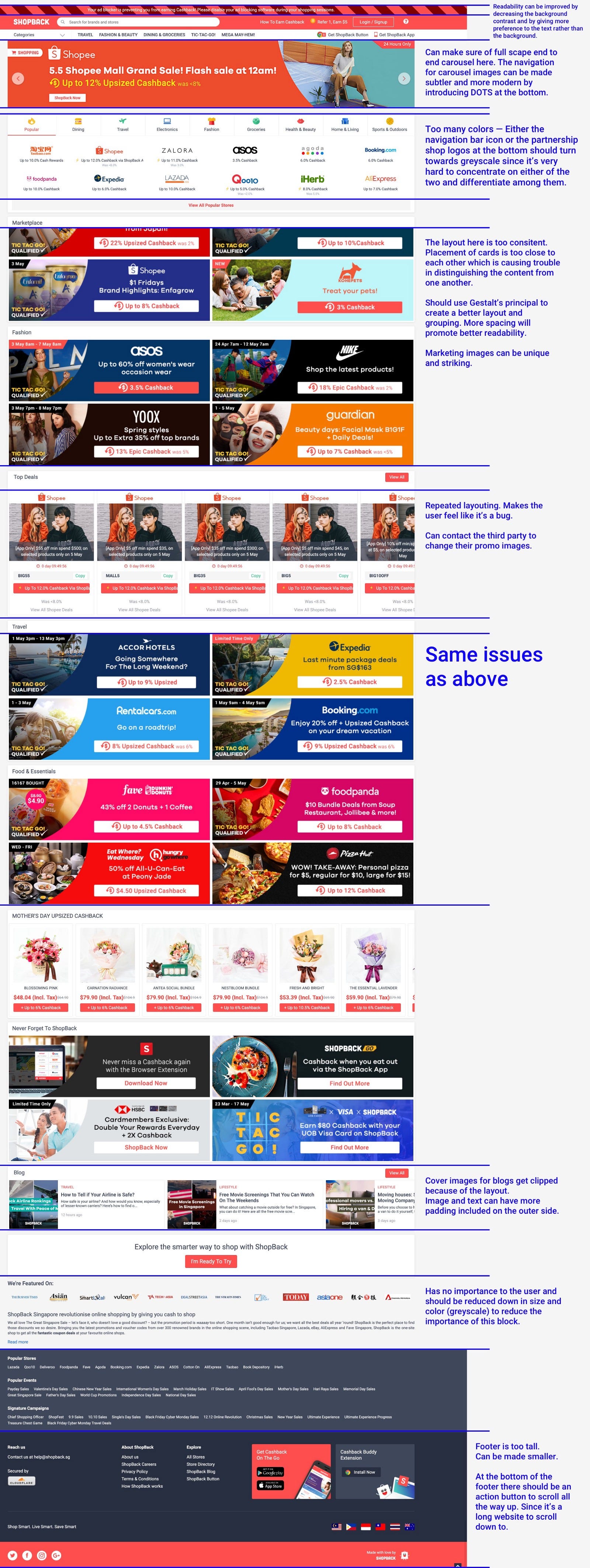
Upon quick inspection, here are some points that come to light immediately.
— The website uses a middle layout to optimize for mobile layouts and responsiveness
— Coloured logos and equally coloured icons aren’t able to provide enough distinguishing content hierarchy between each other
— Minimalism is missing. Most parts of the website employ loud colours and advertisements to promote cashback
— Top Deals sections come off like a bug with endless repeated content
— SB’s primary colour is close to RED, and that can bring some negative feelings among new users
— Similar layouts with loud colours can create a cluttered feeling when scrolling thru the website
— Self-promotion can/should be minimized to necessary. We need to remember who this website is for and the purpose behind it
— The footer is too heavy with repeated content from top
— The country selector can appear in the top section for easy selection. Since that might be the first thing a user wants to do to see relevant offers
Fold-by-Fold Redesign
Initial thoughts: The first problem with cashback and coupon companies is that their business model though successful in generating profits, is not interesting and attractive to the end consumers. Users want discounts in some way or the other but it is not the first thing that comes to their minds when looking to shop online. Though we cannot address this mindset immediately, we can provide a memorable experience to the users and make the app/website experience memorable for them. With this thought, let’s start!
Header
This is an important piece and will be the first fold of interaction for any user. We have to showcase the brand here — both noteworthy brands as well as drive the brand value of the company. SB’s primary colour is of a high wavelength and using it might bring some negative feelings. But it can be solved by using it in bigger spaces and more subtly in small places like buttons. This will promote red as not as an alert but as a brand colour. Also using less of red will make the colour behave as an accent colour.
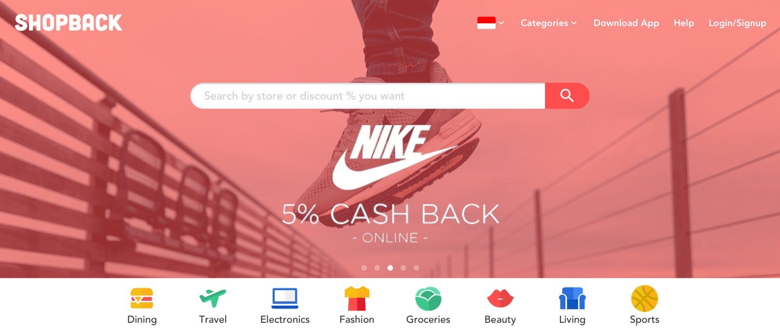
Header Redesign
In the header, I changed a few things. I brought the search right in the centre and used the brand colour in a way that it doesn’t block the promotions side of things. Also, I moved the carousel to an automatic slideshow with mini indicator circles to show the transition.

Old Header Design
Upon closer inspection, I could see that the “Popular Tab” that is shown below has the same brands and deals as in the rest of the page. I took a gamble and removed this tab to actually give each category (Dining, travel and others) more real estate and reduce the clutter overall. Also, this allowed for a bigger size for each of the icons.
Popular Brands
I decided to give all the popular brands/stores a place of their own with more visual appeal and focus. This should drive more attention to them.
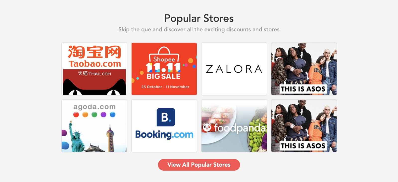
Popular Section Redesigned
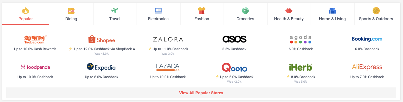
Old Popular Section/Tab Design
Top Deals
Top Deals is one of those sections that it is important to get consumer attention. These ideally represent hot new and curated deals for the majority of visitors. But to make users click we need to provide data to the user and also a visible call to the action.

Top Deals Redesign

Old Top Deals Section
I picked up elements from the original design and just provided an information hierarchy. I decided to get rid of the timer since that seems so tiny and irrelevant. Also, Flash Deals != Top Deals.
Category Based Sections
There are some category based sections like Travel and Food. I guess that the data at SB might be pointing towards these as the top attraction gatherers after e-commerce. The information in these sections will be highly repeated and might just blind the user to end up seeing nothing.
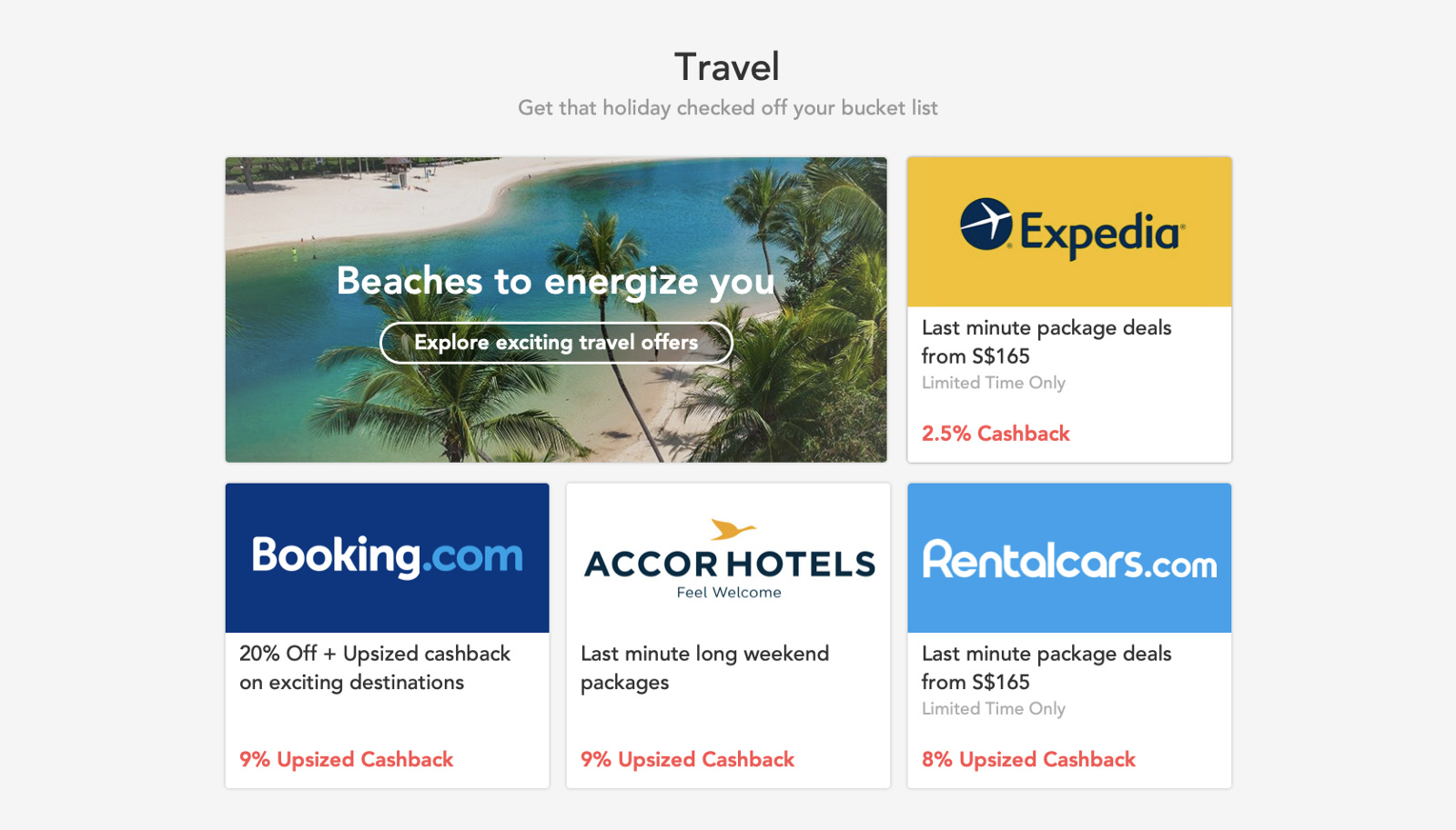
Redesign Travel (sample) Section
I decided to go with a dynamic grid where the block positions can be randomized to break eye pattern reading across different category blocks. Also, I put logos in the focus vs putting pretty pictures of beaches and sunsets.

Old Design for Travel Section
Self Promotion
Doesn’t everyone enjoy a dose of self-promotion on their website? Yes, they do. But let’s try and keep it to a minimum — make it about the users and not about yourself. If consumers are using your product, you are already doing a stellar job.

Redesigned Media Section
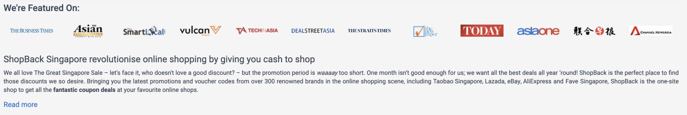
Old Media Section
To move fast, I cut off the number of media/blog logos in the section. But we can include a lot more. A double line should also work. But the colours need to be restricted to greys only :)
Last — Footer
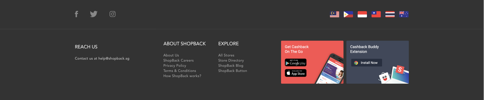
Footer is usually the most neglected section on most websites. They are more of an afterthought. For the user, they are mostly exhausted by this point. If they have reached so far down below, then that means you can give them something that they didn’t get to see above. Maybe they are interested in working with you or want to download your media-kit or even praise you for a stellar job. Repeating the entire content of the website in a concise manner will be an overkill and something that should be avoided.
Redesigned Footer
Keep it short and sweet!

Old Design of Footer
Entire Redesign Experience
End Notes
Why ShopBack? What is the significance of this redesign?
There’s no reason for considering ShopBack. I laid eyes on something I could fix as a short design exercise and so I did it. I hope it helps the creator of this website and others as well.
Since this was a short “visual” design exercise coupled with some UX reasoning that was formulated by my daily web experience, you can choose to disagree with some of the ideas.
I heavily utilized Gestalt’s principle to make the design readable with a strong hierarchy and information architecture. The entire design was intentionally made off in blocks so that if it gets implemented, blocks can be rearranged according to what data point towards.
I hope this was a good read. Let me know your thoughts on this.