Banking UX: Currency Conversion for Digital Millenials
Rethinking Singapore's DBS currency conversion module

Intro
Ever since I came to Singapore 🇸🇬, I have been obsessed with the DBS banking app (on Android). To start, I must say — it’s very well designed as compared to other banking apps I have used so far. Flat colours, bold typography, and clean layouts. After months of using the app, I recently found out that it also has a currency conversion web-based micro-module 😱. For someone living and working abroad or travelling frequently ✈️ to other countries, this is such a handy feature to have. Also, this annihilates the need to download a different app for the same purpose.
To improve this module and overall visibility of it, I decided to jump on a guerrilla usability testing sprint cycle.
Disclaimer: DBS (Development Bank of Singapore) might be having data that this module is actually not that important for higher percentage of DAU (Daily Active Users) in the app or must be having low CTR (Click Through Rate). Hence, they might have kept it as a web solution and given lower importance to it.
Research Adjustment: DBS Redesigned its app? 😱
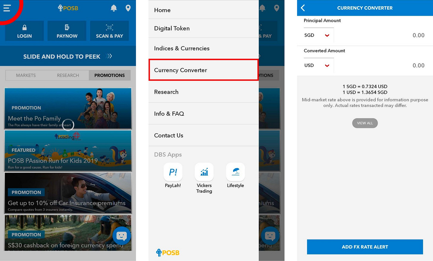
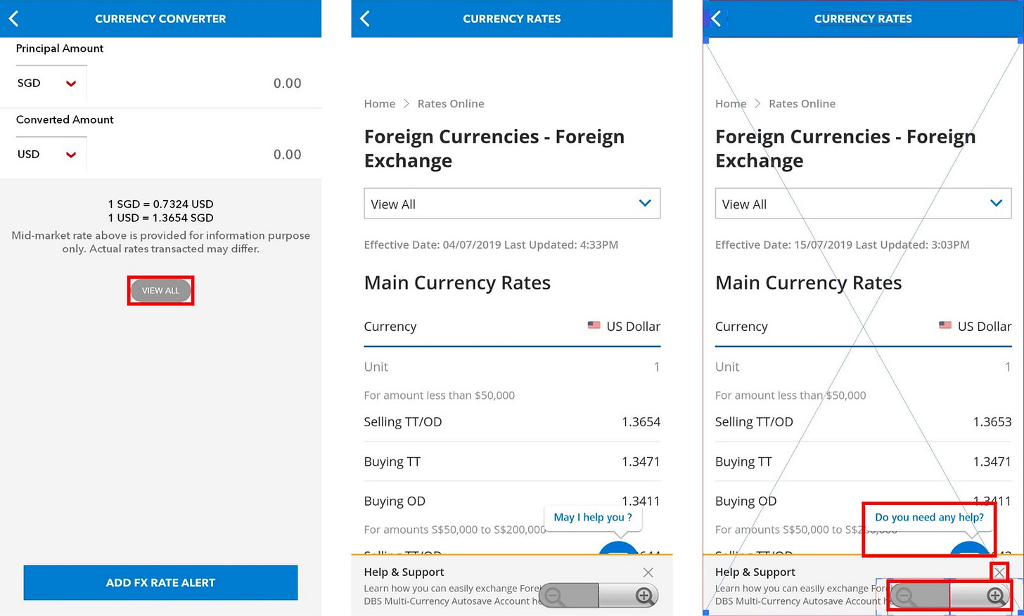
While I was evaluating the app, DBS/POSB released an full productwide redesign that actually made parts of the research redundant. Just for the sake of research, here are the screen grabs from the previous user journey.
Currency Converter App

Adding FX Rate Alert

Inspecting Technical Layout Issues
Thoughts on DBS New Version vs Older Version
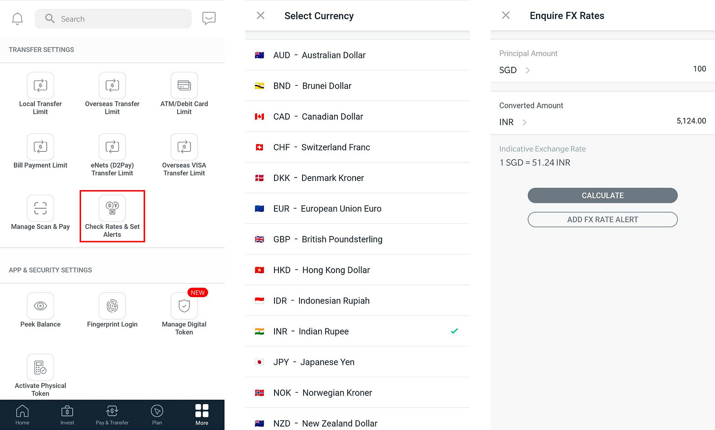
With the new version of the app, DBS improved the discovery for it’s hidden modules/features. Most notably, they have gotten rid of the tabs for Google material design like cards, full screen spanning images, thin-line iconography, and frosted iOS look. Overall, I believe it was a good move from DBS design and product teams to have finally invested time to work on the age-old app.To target the new app design better, I changed my research queries a bit and conducted interviews again. Unfortunately, the currency conversion app didn’t change much which means most of the research conducted on that largely remains the same.
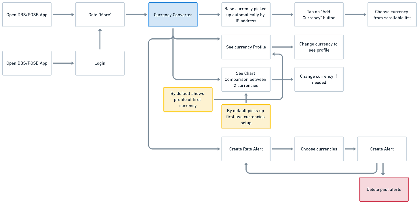
The new user journey for currency conversion app looks like this:

They have largely kept the app module similar. But rather than allowing the user to add a foreign currency exchange rate alert, they have now added the functionality to enter “transfer overseas” flow. This flow enhancement allows DBS to make this a complete full closed-loop journey. More insights for the money transfer flow below.

The flow for transferring was simple enough — Land on the list of recipients ⇒ Add Recipient ⇒ Select Country ⇒ Enter Details ⇒ Confirm Details ⇒ Add Amount ⇒ Make the transfer.
DBS supports $0 fees and same-day payment transfer to 43 countries with DBS Remit. There are strong visual cues to help the user know which countries come under this scheme. 👏 Good job! ✅
One more places where DBS has kept the currency conversion and rate alert feature hidden. Inside the “More” tab accessible from bottom navigation after login. The flow looks something like this —
Login > More > Check Rates & Set Alerts > Select Converted Amount Currency > Enter Principal Amount > Calculate

Research Questions & Results
Here are the set of questions asked during research and how user splits reacted to them.
DBS Currency Converter — DBS/POSB users only
What do you use your DBS Digibank app primarily for?
4/5 users said that they use the app for checking balance, debits and making a quick transfer.
2. Do you know that DBS has a currency converter feature?
5/5 responded with a “No”.
3. Do you require currency conversion? If yes, which app(s) do you use for doing it?
3/5 users responded with “Google” for doing currency conversion.
Currency Converter — Expats/Singaporeans dealing with multiple currencies
When/Why do you need to see currency conversion(s)? What importance does the currency rates hold in your life?
How many currencies do you see the conversion into generally?
How often do you transfer money abroad? Who do you transfer the money to?
What is your process/flow looks like before transferring the money abroad?
How accurate do you require the money conversion to be? When do you need vs not need this accuracy?
Inferences
“4/5 respondents said that they use DBS app for checking balance, debits/credis and making a quick transfer”
5/5respondents — did not know about the DBS Currency Conversion Tool
3/5 respondents — use “Google” for quick currency conversion
3/5 respondents — check currency conversion before travelling to a neighbouring country for holiday/business
4/5 respondents — check a currency (SGD) into different currencies (USD, EUR, INR, IDR, THB) even if it doesn’t affect their main conversion currencies
5/5 respondents — want the app/tool to save their last currency conversion transaction. They usually deal with the same set of currencies over and over
4/5 respondents — want to keep up with the latest currency rates (for specific currencies) even if they don’t intend to transfer money or travel abroad
4/5 respondents — want to see past currency performance reports before making a transfer decision
3/5 respondents — transfer amount to their home countries 5 to 6 times per year
4/5 respondents — require the converted amount accurate up until 3–4 decimal points. Users need more accuracy while performing online transactions vs offline (not that accuracy needed)
3/5 respondents — were between the age of 25–27yrs old
Job Story
Users want an easy way to browse and select currencies and compare their price points at different times.
When — I am looking to travel
I want to — I want to find out the current market price of travelling currency for my home currency
So that — I can make sure that I am getting the best price from money changers
Provisional Personas
I created a provisional persona as a useful jumping-off point to help me make some assumptions and do some preliminary work.

Andrew Tan, 26
Occupation: Associate Product Manager
Behaviour: Hardworking and positive personality. Prefers commute to work in less than 40–50 minutes.
Goal: Save enough money to travel every other month on weekends and public holidays.
Job Story

User Journey Map
Based on the data collected for this exercise, it is clear that a user doesn’t expect different experiences before and after login for the currency conversion feature. Additionally, it should be very simple to access currency conversion feature from the main app.

Wireframes/Flow
Keeping the scope of this exercise strict, the entry point of currency conversion will be kept in the same flow as it is now. But currency conversion and send money can be definitely separated into different apps/features and intertwined in each other since the user will be in a different set of mind while performing either of the two functions.

Visual Design Mockup
Iconography
Let’s start with the icon. DBS’s app is currently using very small icons and some of the icons in the MORE icon tray are repeated. Like for example — “Vickers Account” and “Check Rates & Set Alerts” have the same exact icon has a DBS logo in it which is not needed and makes the icon more complex to interpret and act upon.

Icon redesign
For residents in Singapore, I believe DBS should highlight Philippine Peso along with Sing-Dollar since a lot of Filipinos send money from Singapore back home. But the best solution here would be to keep the icon structure the same, but change the currencies based upon which country the app is being opened by the users. This is a similar approach that was followed by the older Facebook globe icon.
User Interface

Currency addition and conversion experience

FX Rate alert experience
Testing & Prototype 📝
During the design process, I made sure to regularly get feedback from friends who use DBS and regularly travel the globe (before the current circumstances happened).
Simple task list to perform:
Add a new currency for conversion
Create a conversion rate alert for money to be sent back home
Delete an already added currency from the conversion list
Problems that still exists
After testing there are still problems with the interface that I observed during user testing.
The icon is still very easy to be missed out. It took more than 10–15 seconds for the user to find it from the list
The loops that the user has to go thru to reach Currency Converter are still many. There is no easy way to do it yet.
Solutions:
Icons can be made bigger.
Search can be implemented to find the features a user wants.
There should be a way for the user to create a home screen shortcut from the app’s micro-feature.
If the user is dabbling between multiple currencies then the app should suggest using the currency converter. It can also be surfaced more for such users.
Note:This case study was started in March 2020 and due to the changing circumstances it took a lot of time to bring it to completion.
Thank you for reading! If you enjoyed this case study or have any feedback, ping me at dhananjaydgarg1989(at)gmail.com or connect via LinkedIn. And please follow me on Twitter👋

