


Case Study: Empty-States in Payments
Conquer all empty-state fairies


Empty states are fun — until they are not. They are one of those things designers either love or simply hate. Getting them right is tricky and newer design talent usually get them wrong. If you go to Dribbble, you can see thousands of empty states. Some are truly very impressive, some can be better. In my experience, there are no right or wrong answers to these.
After working on a few different projects, I have understood a thing or two about empty-states. The trick is to change your thought process with each project based on demographic, product type, insights and user sentiments. Ultimately these are awesome pieces of illustration art but their visuals are strongly connected to user emotions.
In this post, I will go through one of the projects that I worked on while I was still learning all about empty states and their importance in the startup tech industry and explain the thought process behind the final locked down version.
Project: Payments (e-Wallet)
Problem
Create empty states/illustrations that make the users feel positive at all times. Failures or empty screens during a wallet flow aren’t always a good sight plus when you do monetary transactions (deductions), you aren’t always happy during the transaction journey. How do you make it a positive used case for the users?
Solution
Most payment/banking apps are overly plain because either they are following other apps/competitors or they want the user to focus on the task at hand and keep the seriousness of the system alive. But we are currently seeing a change in this. There is an influx of e-wallet apps and they are changing the face of banking completely. The way things are changing is — Millennial are using trendy mobile apps for making real-time payments while older generations are more comfortable heading back home and making payments thru’ their laptop/desktop machines since they consider monetary transactions to be more vulnerable to security/theft. Also, in one of the recent surveys, banks still came on top when it comes to people trusting a financial service for their money.
I got a chance to work on an e-wallet mobile app and here are some of the illustrations and the reasoning behind them. As a routine exercise, each one went thru’ a set of interesting discussions and finally, one was decided.
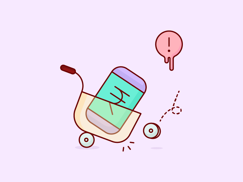

Something went wrong — This was used across multiple used cases (with respective copy changes). Especially when there were abandonment issues or when the system failed to load the content. This was especially relevant since it was slightly funny and static, a feeling of motion was added to it though.
—


So as you can see from the above examples, the empty states were coloured and cheerful. For screens where we can’t really suggest action on the user — like No Receipts, it was just left blank. While for Transactions, an action button leading to the transaction flow was added to help them move forward.
The copy accompanying each empty state was largely kept plain without any funny remarks since the research suggested people in India still looked at Payments in a rather serious light. Any funny messages might be misunderstood or not taken in the right way.


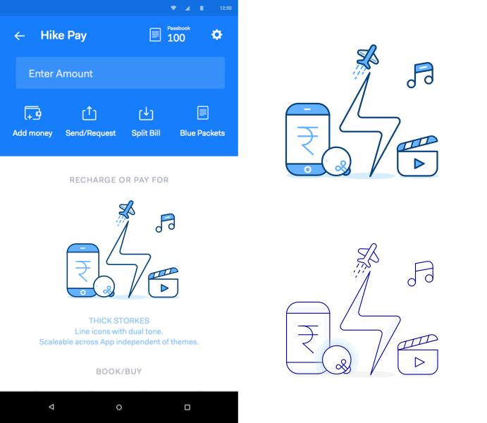
Loading screen and Earn Dialog
For something like a loading screen, the illustration brought together a bunch of important metaphors that the app would be dealing with once the user gets in. This allowed us to set up an expectation in the user’s brain without saying much. The design and composition were inspired by a set of visuals used by Google in one of GPlay’s intro illustrations.
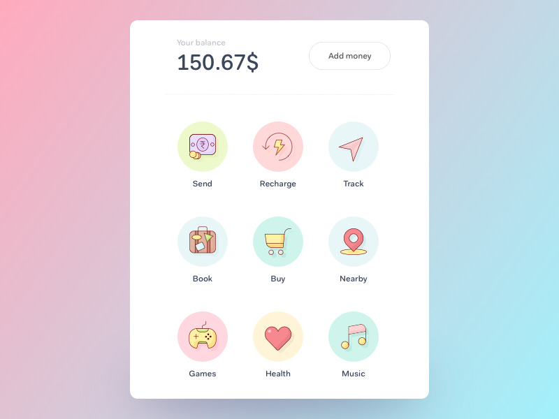

The illustration style for empty states made everyone in the team so excited that everyone decided to take it forward and apply it to the icons as well — these icons will lead the user towards payments platform and other services as well. The pastel colour palette and soft edges actually worked with the team. What happened next was something I and the team didn’t really foresight.
We went for a usability discussion on the UX and though we got helpful insights on the interface, the illustrations and colour language overall came under heavy criticism from the users. Users were unable to relate the interface with a ‘serious’ payments app because a competitor app which was already established used single tone colouring across its app and the users related to that tone.
Degraded Empty State Illustration [Test Shot]
During the interviews, users hinted towards the colours feeling too funny — like a game and they even told us that the app should be more like their daily banking app since they are more used to that for any payment-related services. For a moment, I actually thought we were before time in doing things the fun way.
Based upon the feedback, we actually just degraded the colour language for the app and illustration design with it but kept most of the metaphorical fun intact. One idea that came during all the discussions, was to cut down on all the fun — colours, rounded corners, metaphors and stories — and just go with simple metaphors with standard illustration style.

As you can see from above. The feedbacks kept coming from all angles and the illustration on the rightmost is what came out to be. The initial understanding of modern-day payments design was wrong. Though users have moved onto using new apps that put payments and transactions on their fingertips, it is still money based. Users still want simplicity.
The evidence is clear, apps such as PayTM, AmazonPay are thriving in the Indian payments eco-system. While companies like Zeta, MobiKwik and others are hard to even remember. This reminded me that in the startup world, nothing is more important than the timing of an idea — not the execution, not the VC funding and sometimes, not even the idea itself. Maybe what PayTM like apps are doing is too dated and needs to change, but at the current moment, that’s not true. Their methods are working very well and users are finding simplicity in it.
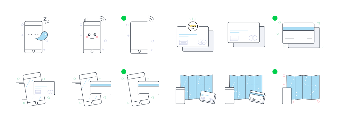
Here’s a quick iteration on the last version. Simplified and aligned with the feedback. The ones with the GREEN dot were the final ones that the app launched with.
—
Learnings:
Psychology Principle: People crave Mental Models.
Design Heuristics: Match Between System and the Real World
Simple lesson learned after going thru’ this exercise. Illustrations can follow design heuristics as well. We have to start considering illustrations as more than just a fancy piece of art.