


Case Study: Text-2-Sticker (T2S) Design Framework
Giving users more flexibility for custom sticker creation

Design Principle
Flexibility and efficiency of use + User control and freedom
— The system should aid users in simply expressing themselves whenever they want to. This is especially true in a chat/messaging environment. This case study highlights how a simple solution was created and redesigned for users to express themselves freely on a messaging platform.
This project was designed while I was working at Hike Messenger as an ongoing effort to give users more flexible ways to express themselves and keep up with the ongoing demand for adding new sticker designs to the system.
Fact
The Global Language Monitor (GLM) estimates that in the modern world a new word is created every 98 minutes (approximately 14.7 new words per day). Each year, an estimated 800 to 1,000 neologisms are added to English language dictionaries (in the 20th century alone, more than 90,000 words have been added).
This is true. Now, given the fact that India has 13+ languages, this problem becomes 13x it’s original volume. How do we solve this need for a growing millennial Indian population?
Solution: Create a unique way for users to create their stickers.
But how do you create this solution? Stickers are fun, illustrative pieces of art. Creating a software flow that will allow users to create their stickers should be a very complex flow with so many different options like shadows, colours, fonts, characters, shapes, angles, warping, rotation, etc. But in the true sense, a sticker is nothing more than just an illustration with white outline stroke and some drop shadow at the back. The mental model of users at hike-messenger has been established in this way.
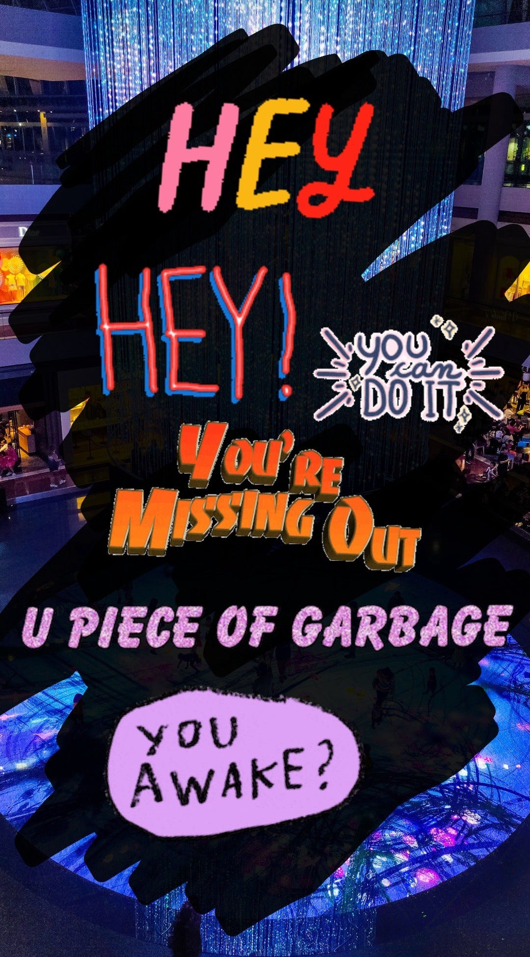
Just a sample showing text sticker
We knew that ultimately we have to create something that elaborate that allows users to create a full-fledged sticker using just the app. But for now, in true startup sense, let’s create a pilot design and float it into the app. The pilot was to bundle in 2–3 fancy-looking lightweight fonts in the app and give them as text options to the users.
These text options would appear as the first thing and will be combined with a white outline stroke + drop shadow for users to believe that they are stickers created by them on-the-fly.
The pilot design was monitored and solved for bugs over the next couple of months before finally looking at the data. If the data was compelling enough then we can devote more dev+design bandwidth on it.
User Reviews
We received tons of user reviews on the app store/play store. Positive reviews + free feature suggestions that would help create v2.0 of T2S.

Three user requests floated on top as they were repeatedly requested:
More Fonts
More Colors
Different Colors in the same Text String
Animated Text for special words like — Awesome, Love, Cool
Data
After discovering T2S, 45% of users made use of it on Day1 (D1) as compared to 31% for normal stickers. While both for T2S and normal stickers, the usage tapers down, for T2S, the usage tapers down to 8% while it is 7.6% for the other.


Based on the early adoption rate, the usage for T2S falls at a lower percentage than normal stickers. Though both of them falls to a very similar %age.
Also, something to note here is that T2S can only be used from the recommendation tray while normal stickers can be used from both the recommendation tray as well as the palette.
Project Target T2S v2.0
Based on user feedback and existing bugs in the feature, a checklist was created nailed down as a project target.
Find fonts that are of the same character size: It is very dev heavy to code T2S creation for each font. Custom coding would slow down the app and requires more battery consumption. Finding fonts of similar (if not same) character size is a much simpler solution.
Restrict the number of fonts to 6 or max. 8: This is to keep the APK file size in check.
Map a cyclic colour chart that can be implemented: Something fun. We are going to add colours anyways. Why not try something new while doing so.
Map the change in font size based on string length:[Yo!] is not the same as [Hey Man!] This makes sure that both strings/words get different weight based on string length. This will eventually create a visual distinction between words in chat driving more appeal to send small strings of text (because they appear bigger).
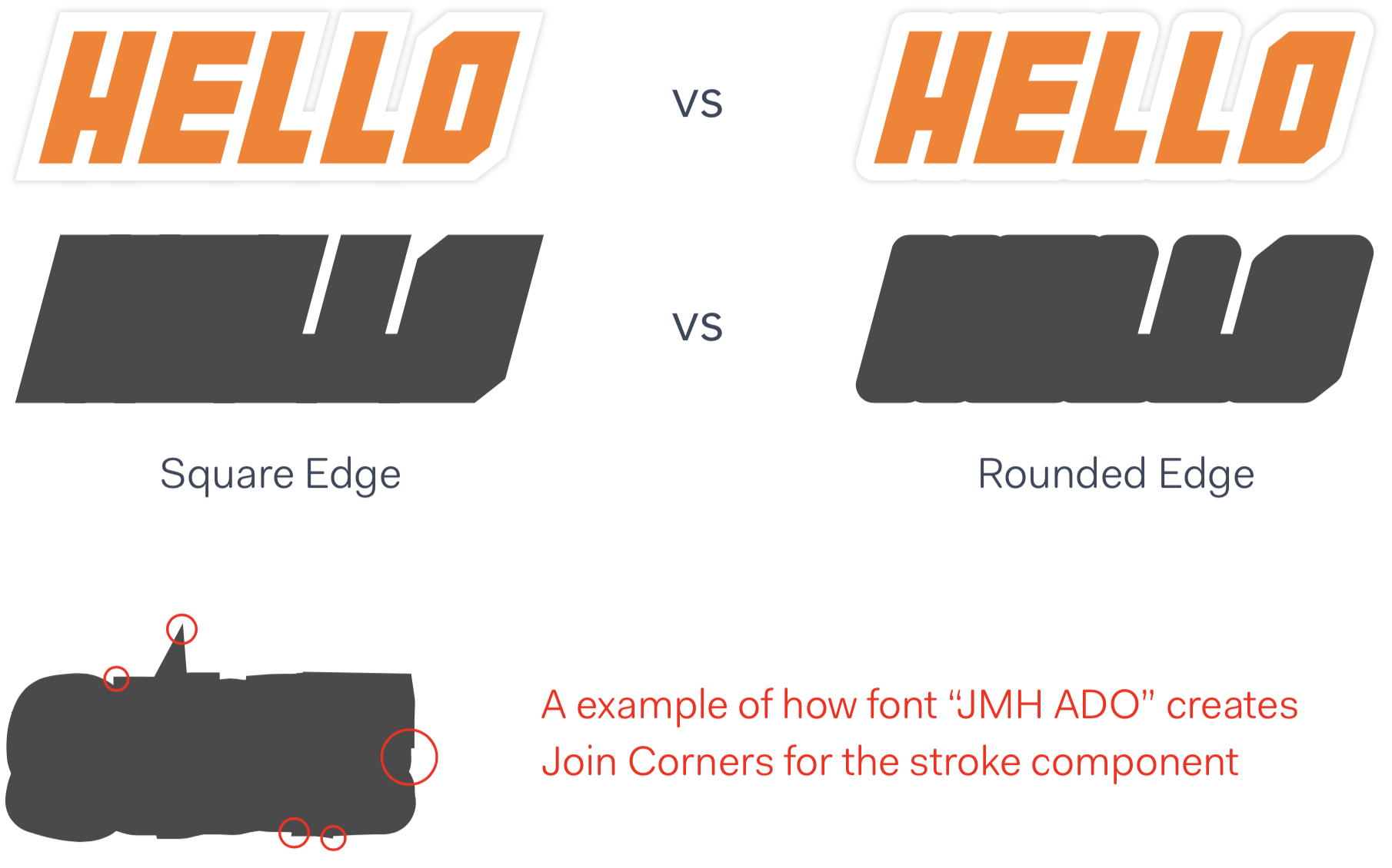
The outer border/stroke should have a rounded join & rounded cap: A unique bug but have to be solved. We will discuss this in the article later.
When there is a conversation happening meaning an exchange of message with another friend then should we lock the font (& colour) for that exchange?
Is it possible to fill the white gaps between words?: Good to have. Not necessary.
How would we support the older builds? Think — Backward Compatibility
Figure out the best value for drop shadow and border thickness (without making them too overwhelming) [Design Refinement]
New Fonts

1. Ribeat
2. Bushcraft
3. Cartwheel
4. Chewy
5. CCBattleCry (default font)
6. Tokyo 2097
Each of these chosen fonts is similar to each other in terms of font height, line height and font size. This helps us in designing a guideline that is common for all these fonts without making some of the fonts look too big or too small for given font size. It stays more or less the same. This, in turn, reduces the final code complexity and the number of variables that need to be tackled by the app engine at any given point in time.
Colours

Colours for T2S are a splash of vibrant, bright and saturated tones. As you can see, colours travel from their brighter types to their less bright ones.
Stroke Type

The stroke around the text has rounded ends and rounded joins.
When compared side-by-side, the rounded edge gives a much more pleasant feel. Plus, it makes sure that the border doesn’t split unevenly in any scenario because every font is designed differently and we can’t control the typeface in anyways.
Drop Shadow & Stroke Size
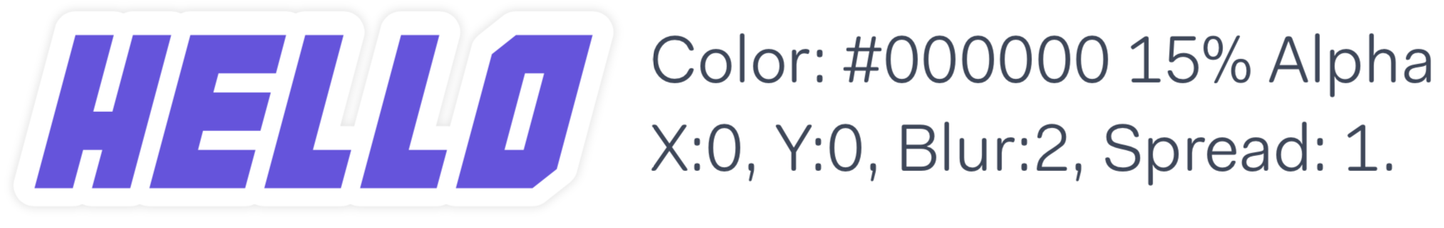
Ideally, the drop shadow should have below given values. The current value of 0.17x of font size works. For white stroke size, the current value of 0.15x of font size works to give the desired result.
Font Size
We have 255dp width space available for either side (sender or receiver). We are trying to optimize font sizes in such a way that smaller words look more appealing and longer strings look so too.

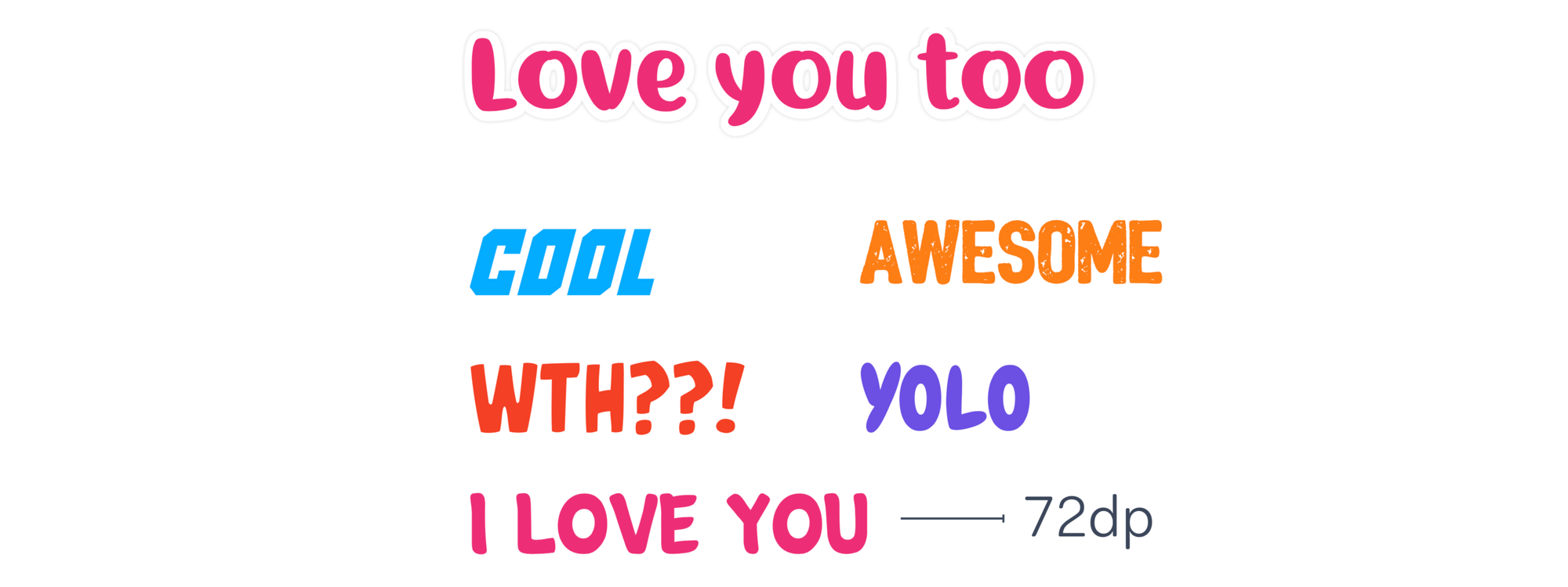
Special Cases
In special cases, the app can act with a static setting to provide the user with a delightful experience. For example: When sending the text “Love you too” — we detect this phrase and always use this font with pink as the text colour.
Other such examples can be Cool, Awesome, WTH??, I Love You, YOLO
Some standard words from the Ai-word-cloud
Final Implemented Result

Chat
Timeline
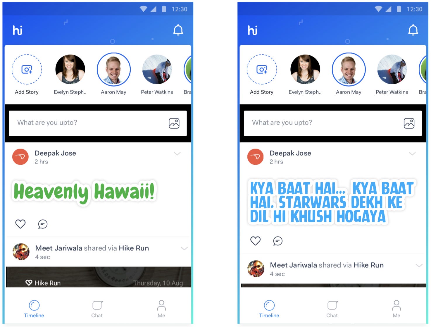
Backward Compatibility
Chat

Backward compatibility can be handled by defining a default font in the code to which the code will point in case of font absence.
Currently, T2S has had two builds with one of the default font defined. The same can be done here. In this version, the default font should point to CC Battlecry.
Additionally, we can insert a card that will prompt the user to upgrade to a new build and see a better experience.
—
Timeline

If you are on the v2.0 build of T2S and post a timeline update using T2S then for everyone that is on an older build, the display font will be their default which is — BUBBLEGUM.
This stays true when an update goes from an older build and is seen on a new build.
The font size for T2S on the timeline will remain the same as it is in the current implementation.
End Notes
This design exercise over a small window of 2–3 weeks. More time was devoted to research and development as compared to pixel pushing. Animations weren’t added in the final version both because of dev bandwidth and high battery consumption. As font rendering gets refined on the OS level, I believe this solution can be improved to deliver an even awesome feeling to the user.