Food Delivery UX: Alleviating invisible user problems
Solving small user problems using minimal research methods
I have been working with a mentee thru’ Designed.org from a Transport 🚕 & Food 🍱 super app from South East Asia (SEA) called Grab. His main pain point is that his company doesn’t spend time improving user experiences because they don’t yield any monetary gains for company growth. These more nuanced user experiences can also be called invisible UX problems, and he wanted those problems to be addressed.
Having some experience with this kind of problem, I suggested he pick up end-user expertise to change and do a real-life user-research-study to take it to the next level (with small design changes). If the experiment goes well, he can highlight the results to his manager/team-members and get some engineering bandwidth allocated to such projects in the future. We decided to do a small experiment with a 50–80S$ budget and capture how we can improve experiences quickly with limited resources at our disposal.
Grab Delivery Riders
During the C19 pandemic, delivery riders are unfortunately poorly hit. Most people are scared of ordering food online, and delivery riders don’t get paid much. Grab delivery riders earnS$6 to S$10.50 per delivery 🤑on average. Grab also keeps increasing it’s a delivery fee. On Reddit, some Singaporeans reported the delivery fee increased to 87% of the actual meal order value during one instance. Grab was gracious enough to give a break-up of where this delivery fee goes on their blog 👏👏👏.
But there is one other place where Grab delivery riders can earn some money, and that is through voluntary customer tips per order. So all-in-all, a Grab delivery rider makes through delivery fee + base price + customer tips.
Customer Tips
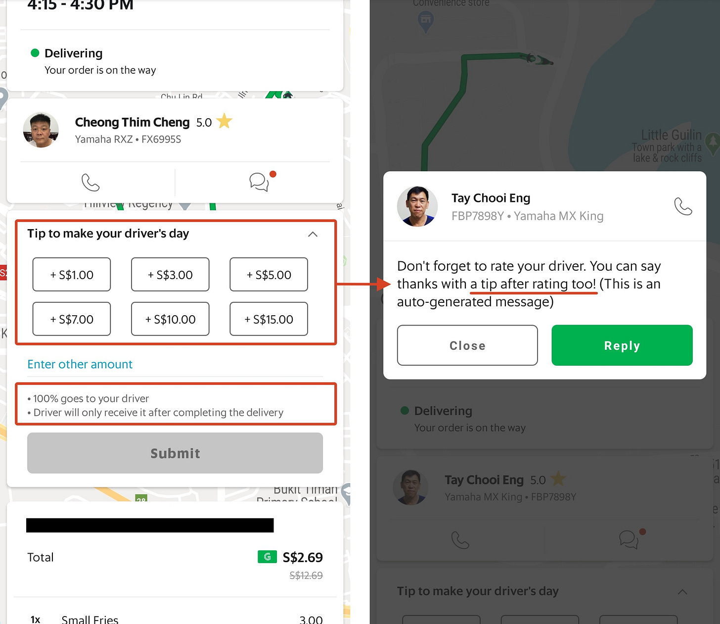
Grab delivery riders getting generous customer tips can be a massive advantage if Grab improves the tipping experience and urges customers to help riders earn some extra cash on the side. Let’s take a look at how the current customer tipping experience looks like.
Current Flow Breakdown
Order Food. ✅
[Good UX]When a delivery rider is assigned to the order, then you start seeing the tracking details. ✅
[Good UX]The customer can tip the rider before delivery is made successfully. ✅
[Good UX]The customer can quickly tip the rider for a designated amount of S$1, S$3, S$5, S$7, S$10, S$15. Grab allows for quick selection. ✅
[Good UX]The customer can add a custom amount using an input box.
[Good UX]The customer is informed through a helper text that 100% of the tip goes to the driver and it will only get credited to his account after the delivery is marked successfully. ✅
[Good UX]Once the order is completed, and the customer is yet to rate and tip the delivery rider, a push notification is sent to his/her device to do the same. ✅
[Good UX]Customers can tip their delivery riders up to 72 hours upon completing an order via their app's Activity. ✅
[Good UX]
Everything seems right here. Let’s dig more and find out if Grab deliver riders are actually getting the customer tips and how much they get? 🤔
What did we need for this study?
For conducting this study, I will be combining a summative evaluation with a formative assessment.
Formative evaluation is a type of usability evaluation that helps to “form” the design for a product or service.
A summative evaluation is also a usability evaluation but usually for complete or near-complete design under realistic conditions. It can be used to determine if the plan meets specific, measurable performance, satisfaction goals or to establish a usability benchmark.
We will make five food orders that are valued at approximately 10S$ each.
At the time of delivery, we will handover 5S$ physically to the rider to help me understand how many times he gets the tip on an average and how much it is usually. 5S$ will act as an incentive for the research study.
If the response is positive, the rider gets a lot of generous tips, and the amount is more than 5S$, and then I will stop the study. Else we will do a small redesign of the experience to fix the gaps by taking additional customer feedback.
Post the redesign; we will tap into five friends or known associates to understand their tipping behavior with the current design and then the redesigned version.
If the results are better than previously reported, then we will stop the study. Else we will redesign again and perform Step-4 and Step-5 also.
We will have two personas for this study. Persona 1 — Grab delivery Rider. Persona 2 — Grab customer.
Feedback (Grab delivery rider)
3/5 Grab delivery riders usually didn’t get an additional tip (only occasionally). [Q. How frequently do you get recommendations from customers?]
Riders who got the tip only got 5S$ or less. [Q. How much information did you get?]
4/5 riders expected a tip of at least 5S$ on more oversized valued orders. [Q. How much did you expect and why?]
Feedback (Customers)
4/5 customers never tipped the delivery rider. [Q. Do you tip the Grab delivery rider? If No, why? If Yes, how much?]
4/5 customers choose not to tip because the perceived value of the delivery fee was already high.
Customers want the delivery fee to be reduced for high-value orders at least.5/5 customers didn’t the value their tip could provide to the rider. If an order is hard to carry, customers will tip the rider for 5–10S$.[Q. How do you decide the tipping value?]
5/5 customers found the idea of feeding their delivery riders with something compared to giving them money attractive. [Q. Would you be open to buying/feed your delivery riders or provide them with cash as a tip?]
The Gap
- Delivery riders expect a tip while customers don’t want to give it to them because the delivery fee is already added to their orders.
- Customers find it hard to equate a tipped value to its real-world value.
Solution
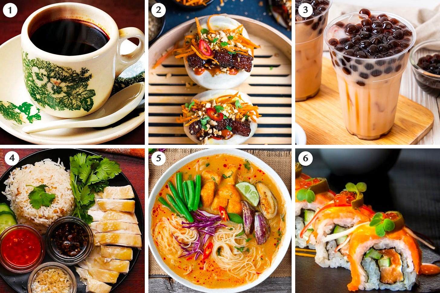
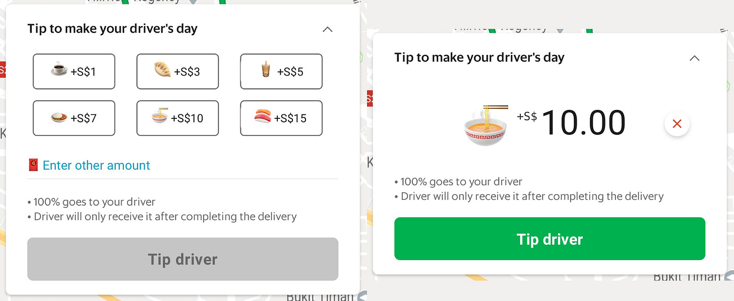
Since this UX is food-related, let’s find the top food eaten and top beverage drinks in the Singapore region. Then let’s equate those items with our quick selection tip values — S$1, S$3, S$5, S$7, S$10, S$15.
Kopi-O ☕ — S$1
Bao/Dumpling 🥟 — S$3
Bubble Tea 🧋 — S$5
Chicken Rice 🍛 — S$7
Curry Laksa 🍜 — S$10
Sushi 🍣 — S$15 (Sushi is not a common man Singaporean dish, but is sold at a high price when sold in food courts/restaurants)
🧧 Red envelope for the custom amount ($$$)
Change of tipping card UI (feedback)
I added the respective emojis with the tipping value to inform the consumer that they are feeding the delivery rider to a bubble and not just S$5. This raised the eyebrows of the customers a bit. The emojis brought focus to the tipping part rather than it being ignored. Customers loved 🥰 the fact that emojis were relatable to them (in Singapore).
The change in the tipping UI did not change the customer behavior, though. It brought focus, and they understood what they were giving to the delivery rider, but that didn’t motivate them enough to submit the tip. The delivery fee was brought up as an issue by 3/5 customers.
End Result
Though the end-result of the process didn’t turn out to be what we expected — it was an excellent exercise because:
We were able to complete the exercise within seven days.
We spent not more than 80$ during the whole exercise.
The redesign was small and technically feasible.
The redesign drove focus and attention towards the tipping UI from the consumers.
We understood how Grab delivery riders and consumers feel about tipping to take & support essential decisions in the future.
We were able to localize a part of the product and make it feel more emotional to Singaporeans.
Connect with me over LinkedIn or Twitter. Alternatively, you can also book a design mentorship session by sending a request on Calendly.

