Intro
It was hackathon time at Hike Messenger and everyone was gearing up a few weeks before starting their 24hr hack projects. I started plotting my dream project with a fellow designer who had super cool character design and animation skills. We worked together in the sticker design team at that time and both were incredibly passionate about all things anime, cartoons and comics.
Team Members
Murtuza Ali Hussainy
Character Art, AnimationDhananjay Garg
Product Design (UI/UX)
Design Tools
Sketch (Interface Design)
Adobe AfterEffects (Animation & Sound)
Adobe Illustrator (Iconography)
Adobe Photoshop (Comic Panel Drawing)
Problem 🤔
Reading experience of web/mobile comics is pathetic. Comic viewing apps don’t optimize the reading experience for the user’s reading patterns. Digital version of comics still looks like a scanned copy of the printed version with no additional experience enhancements.
Opportunity 💭

— But how does something like this fit into a messaging app in its core?
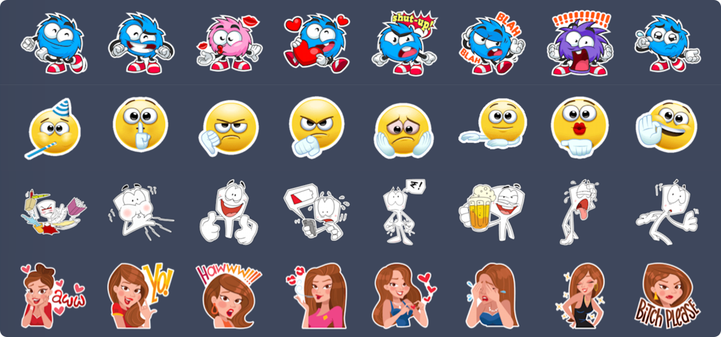
Hike Messenger has a huge variety of stickers built into its platform, which contains tons and tons of interesting character designs. By exploring these characters users will be able to relate better to the app’s core and will spend more time in the app (since reading comics takes more time than just chatting with friends). Research showed that with more and more characters getting created for the app, users are engaging lesser with each of the characters.
Duration ⏰
24hrs
— We split the time into [2+9+4+9] which is 2hrs of brainstorming, discussion and what needs to be done 💭, 9hrs of the actual creation of screens, wireframes, comic covers and a few comic panels 🎨 , 4hrs of sleep 😴 , and remaining 9hrs of just refining the presentation video 🎥 .We kept the scope of the project strict and something achievable within the designated time — Make the reading experience easier for users in both landscape and portrait mode. Make the solution appealing for users as well as for fulfilling important business metrics.
Different Comic Types
We wanted to cover a few different comic types from Hike’s target audience perspective. After doing quick research and downloading a few comic and content apps we decided to go with —
Web Comics (single panel and easily snackable)
Digitized Print Comics (multi-panel storyboards)
Memes (Do memes qualify as comics? — with users spending so much time engaging on platforms like 9GAG, it made a big use case)

The journey from Print to a Web Comic
User Journey
Since the end-goal was a video presentation we designed the user journey in the form of a timeline of frames as well.

Artwork & Mockups
Keeping the user flow in mind, Murtuza created supporting artworks. We decided to design just one single panel comic and put all his cosmic energies into designing the panel by panel comic experience.
To not waste any time, I was designing the mockups and combining his artworks into the mockups directly.

Stitching it all together
Stitching it all together in a single timeline involved tweaking the timing of screens in aftereffects and putting everything in its rightful place. Mostly done in After Effects and found a stock sound on AudioJungle.

Result
The result (video) was something cool and appealing for the viewers to engage in under 60 seconds.
We had 3 minutes to present our project and we split that into 1–2 minutes of helping everyone in the room understand the problem and business opportunity and 1 minute of the actual video as a solution.
We did win the best presentation award for our video but unfortunately, the business ROI was not enough to get this idea baked into the product roadmap.
Learnings
If we were doing this all over again then would surely spend more time towards enhancing the reading experience by introducing more indicators like -
Page numbers
Reading progress on the cover listings page
Artist information
Audio for each page with slideshow transitioning


