Icon Design System for a Super-App
The journey of creating a robust and connected icon system in a startup
It was 2016, and I was working at Hike Messenger as a Product Designer. Hike had gone through tough times and survived a whole journey of user churns due to weak social network in the app. But the good news for the entire team was that the team had a new target which was Hike super app.
Hike used a small bundling mechanism that allowed the team to bundle a 1–5MB micro-app inside the native iOS and Android app. This proved to be a game-changer in times where big product companies were struggling to keep up the app size smaller while still releasing innovative features. With micro apps, we were able to release a whole app-level concept to the user, run surveys and do quick A/B testing with different bundle designs. This felt awesome for a while and then the number of things that were getting integrated with the app name swelled. One of the major problems faced was keeping up with the design language across a host of micro-apps.
We started building a new design system and I was given the mantle to redo the entire icon design system. There was a humble set of 50+ icons when I started doing this but with the redesign, I was expecting the icon grid to support 300+ icons that would come in all shapes and sizes.
The Start
Rather than creating a grid structure and thinking of all the used cases from an ideal perspective, I started designing a few highly tapped icons in the beginning. I then showed the icons to multiple designers in the team and began to draw the same icon in different dimensions to fit them into existing layouts and used cases.
The success metric that I was chasing with all the icon grids were as follows:
Icons should be legible and clickable even on the most shitty of the devices like Samsung Duos.
Icons should be at 90 degrees angle with no 3D perspective unless it’s an existing 3rd party logo.
Icons should convey meaning and hence sticking to widely used general rendition is something that is a must.
Icons should be responsive. The original design of an icon should be made keeping this in mind.
Icons have to be designed for MDPI resolution and then SVG scaled to other resolutions. This way line thickness across the icon set won’t be uneven.
With these and internal testing with fellow designers and random folks walking around the office, I came up with the following constraints.
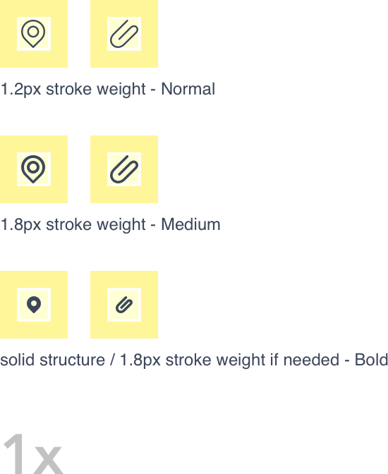
I think the basic problem with the above-mentioned specs is the thickness being in decimal. This means that there will be half pixels in the final design and all icons will be in decimals (float value)?? Ewwww!!
Well, it came down to using 1.2px thickness for normal, 1.8px for medium and solid shapes for bold ones because of extensive testing and trying to find legibility in every icon that I put into the system. 1px thickness was often seen that too thin and 2px as too thick in the feedback. That is because the 1.2px-normal icons will be used across the system. 2px-medium icons will be seen on gradients and picture back only and solid-bold icons for smaller sizes. I kept increasing the thickness with +0.1 and finally, a majority of tests started giving positive feedback.
Once I got a nod on these criteria, I went ahead and put together a guideline for the same.
Icon Guidelines
Intro
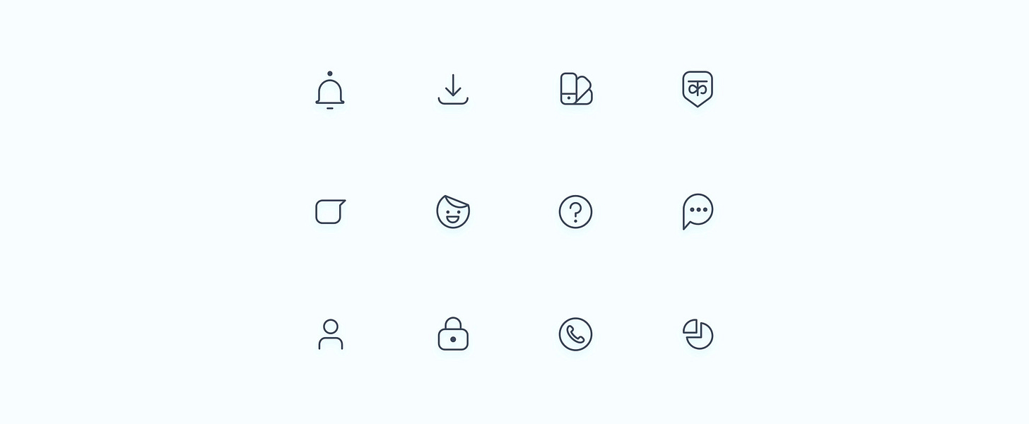
Icons are an integral part of any interface. These provide a swift call-to-action and if carved cleverly, they can help in converting complicated screens into simple ones. An icon should always a common representation — we shouldn’t try to recreate the learning curve for the user unless the feature/action is new and never before seen by the world of apps.
Grid
Content Area = Live Area + Trim Area

The content of an icon should remain inside the live area. Content should only extend into the trim area if additional visual weight is needed. Do not place any part of the icon outside of the trim area. All icons need to be made inside of this grid structure.
Icon Construction
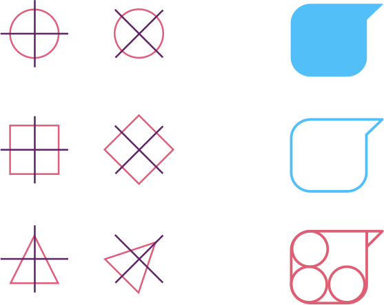
Icons are made with wholes, halves and quarters of four basic shapes: circle, square, rounded rectangle and triangle. Hike icons are unified and placed on the icon grid using these small palettes of unique and simple shapes.
When tilting these shapes, a 45-degree angle is suggested. Irregular shapes are off-brand; every shape needed should be made with a mixture of the ones listed above.
Sizes
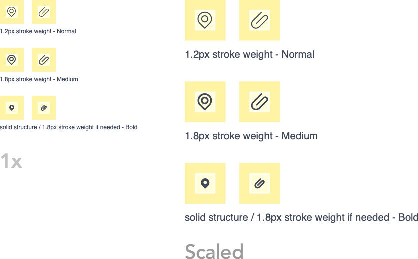
Based on the legibility factor on MDPI resolution which is 1x of all the other corresponding resolutions, icon sheet is divided into three major categories — Regular, Medium and Bold/Solid.
All three weights use the same grid system but exist in different parts of the system to make sure clarity of idea is not compromised.
Weights
The overall family of system icons is unified using consistent corner radiuses, stroke terminal and stroke thickness.

—
STROKE TERMINAL
A 1.2pt outer and inner stroke terminal is used on the silhouette form of the icon.
CORNERS
Big Outer corners are 3.8px and smaller ones are either 1.2px or half of 3.8px that is 1.9px . The corners are made using clean paths with the minimum number of anchor points for a smooth curve.
STROKE WEIGHT
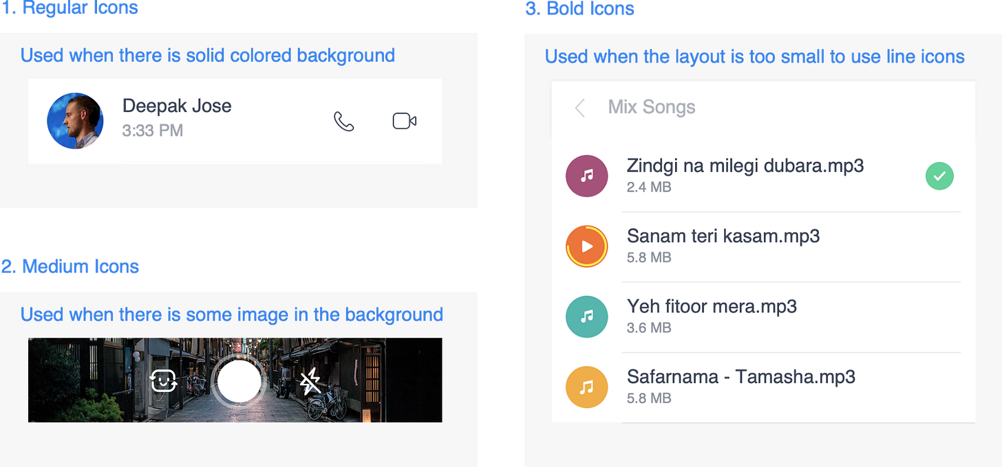
Weights are decided based upon where the icon is getting placed — a big layout or a small layout. Stroke thickness decides the icon weight of every icon in both 20–24–48 icon grid.
1. Regular
2. Medium
3. Bold
Regular icons have 1.2pt as stroke weight while medium icons have a 1.8pt stroke weight. For visual weight balancing icons of regular weight can be bumped up to 1.5pt and 2.0pt for medium icons.
When cutting an icon or creating a gap between two paths in an icon, use a gap of 2.4+2.4=4.8 _or_ 2.4+1.2=3.6 pixels. 3.6px is the minimum that should be used so that the gap is legible enough in the smallest supported resolution plus looks good in bigger resolutions as well. On the other hand, 4.8px is used in exceptional cases where this much gap is required to either be legible (not too close to other neighbouring paths) or it is helping in defining/keeping the form of an icon.
An example of the mic off icon is shown here.

Exceptions
At times for visual balance, we have to play around with the icon thickness. This is something that has to be done/tweaked based on the screen and the kind of icons placed around. Some examples are covered below.
REGULAR

For icons like back and add-new, regular icons @1.2px thickness seems too thin, so going with 1.5px thickness makes these icons look visually balanced with other icons.
MEDIUM

The same goes for medium weight, some icons like ‘forward’ had to be switched to 2px thickness. This helps them get visually aligned with other icons that are @1.8px thickness.
Beyond this, there are also icons like ‘pause’ that look thin and odd-even @2px thickness. For an icon like this, the stroke thickness had to be switched @3px thickness.
BOLD

For icons like friends or group, when kept @1.8px, then they look too dense and less legible, hence we have to reduce the thickness to 1.2px. This helps in making sure the message communicate stays intact even if some guidelines get broken.
Usage
Naming Convention
<parent_type>_<child_type>_<weight>_<icon_name>
This can be broadly applied to all the image types that we currently have in the resources folder (android) in the following way:
ic_palette/nudge_reg/med/solid_<icon_name>
img_mood/stickers/texture/bg/empty/tut_<icon_name>
anim_spinner/interact_<icon_name>
emo_<icon_name>
ACTUAL SYNTAX (in use)
ic_palette_reg_<icon_name>
ic_palette_med_<icon_name>
ic_palette_bold_<icon_name>
ic_nudge_reg_<icon_name>
ic_nudge_med_<icon_name>
ic_nudge_bold_<icon_name>
img_mood_<icon_name>
img_mood/stickers/texture/bg/empty/tut_<icon_name>
img_mood/stickers/texture/bg/empty/tut_<icon_name>
img_mood/stickers/texture/bg/empty/tut_<icon_name>
img_mood/stickers/texture/bg/empty/tut_<icon_name>
anim_spinner_<icon_name>
anim_interact_<icon_name>
emo_<icon_name>
Launcher Icons
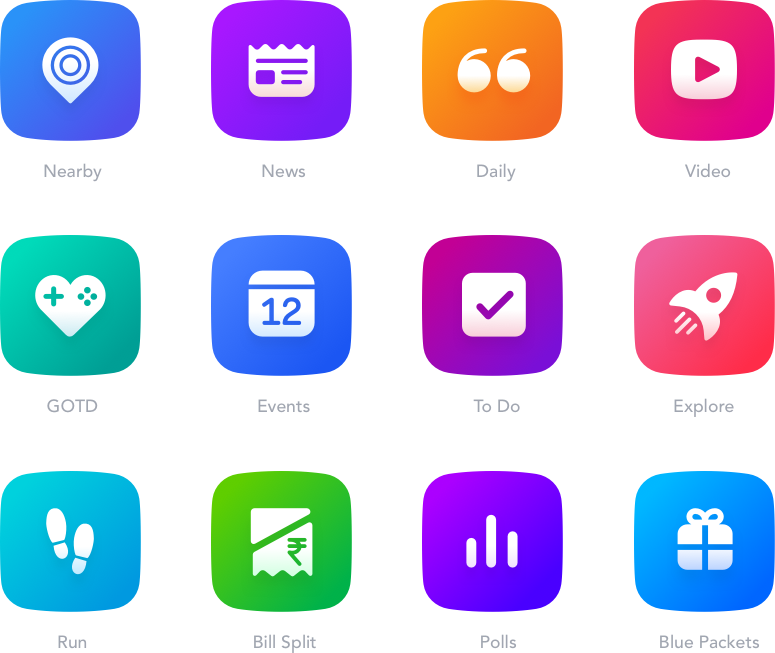
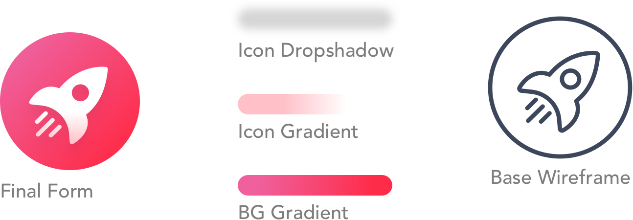
The geometry for the launcher icon remains the same as we are using in our UI icon. In fact, there will always be a bold version of the same launcher icon available in the icon sheet. This helps us in using the icon truly like a responsive one.
Launcher Gradient
The gradient travels at -135 degree angle from the bottom right corner to top left corner. Dark to Bright in such a way that it forms a smooth concave curve without creating an abrupt change in gradient.
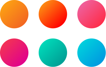
Gradients are usually set with a delightful-bright saturated tone. To reduce the visual weight of the icon, gradients are kept with a monotone feel to them.
Details
Scaling
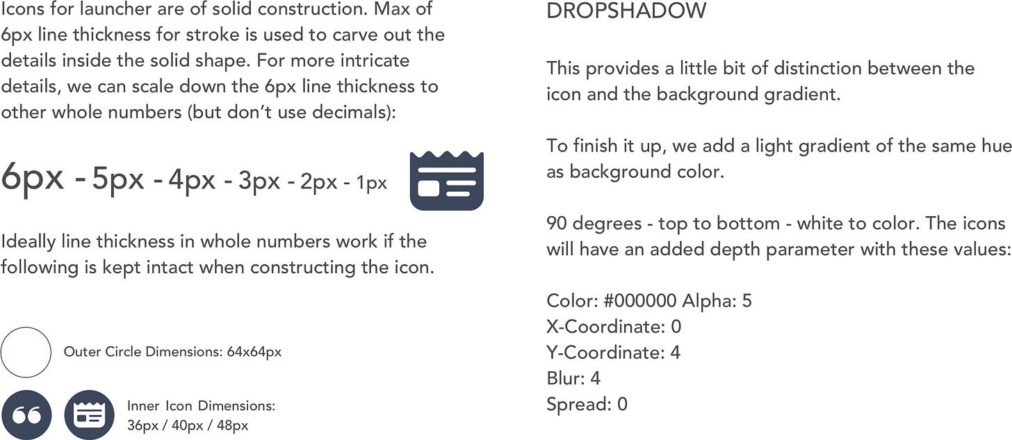
Since the launcher icons are of solid construction, we can simply resize the icons to use them for various UI purposes without the need for adding new assets for every size.

SCALING CHART
1x = MDPI
1.5x = HDPI
2x = XHDPI
3x = XXHDPI
End Result
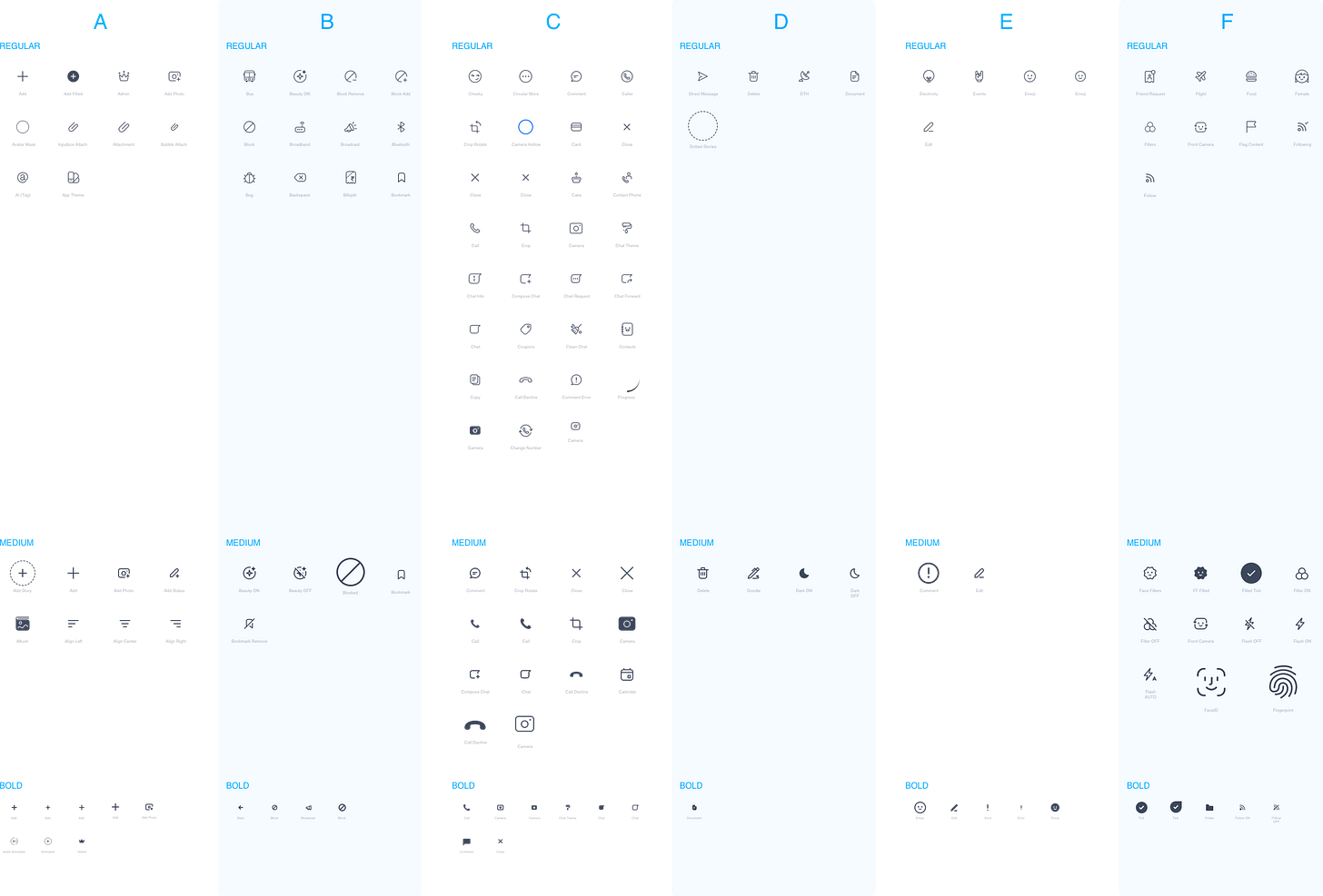
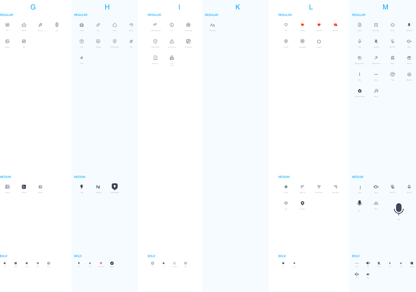
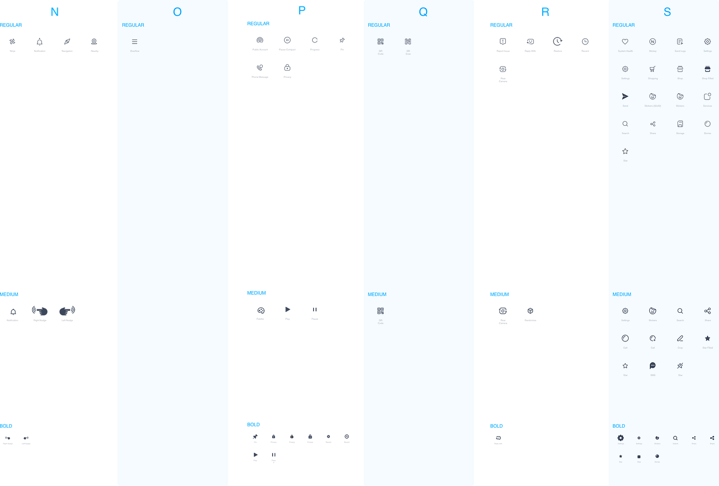
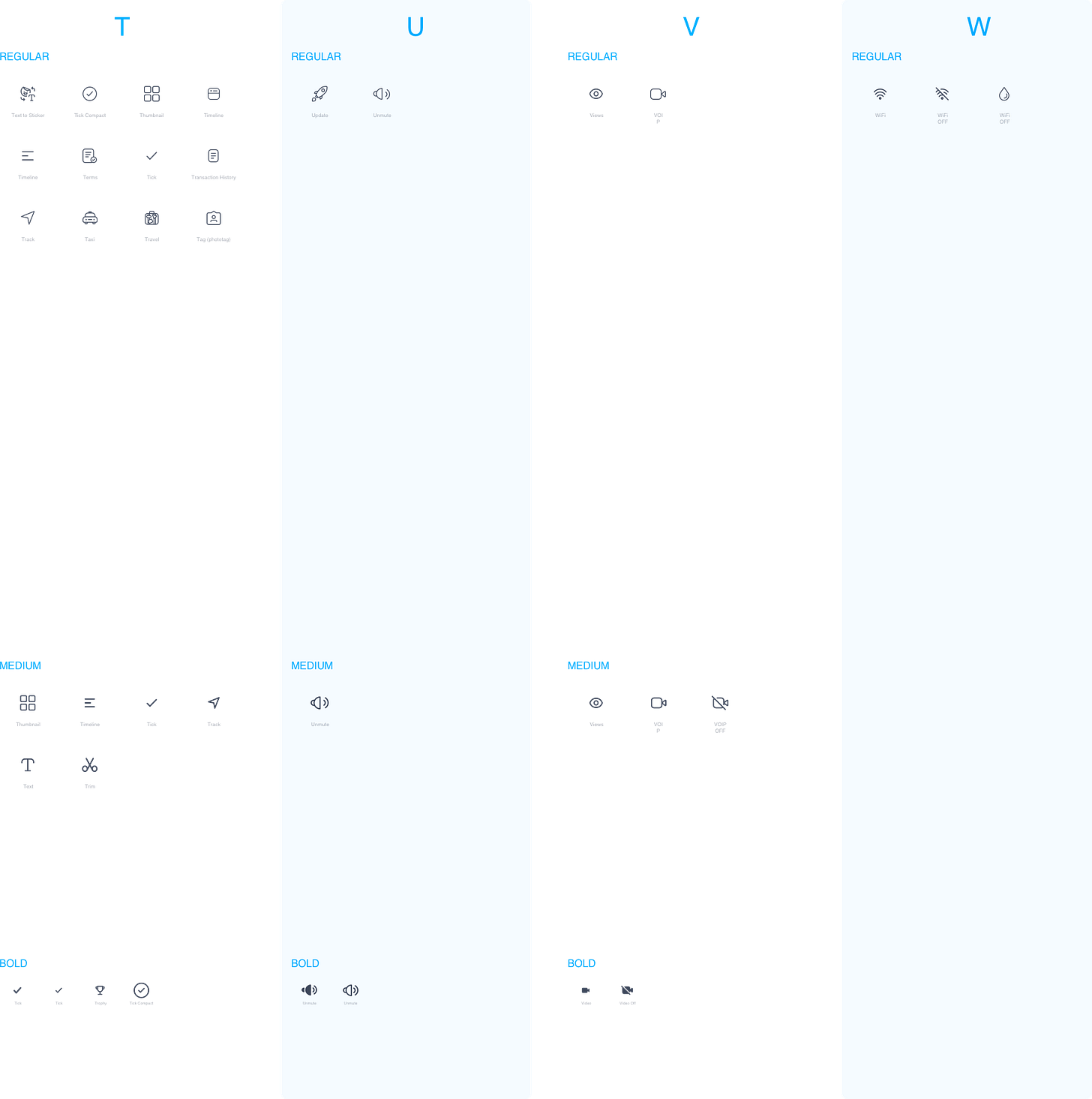
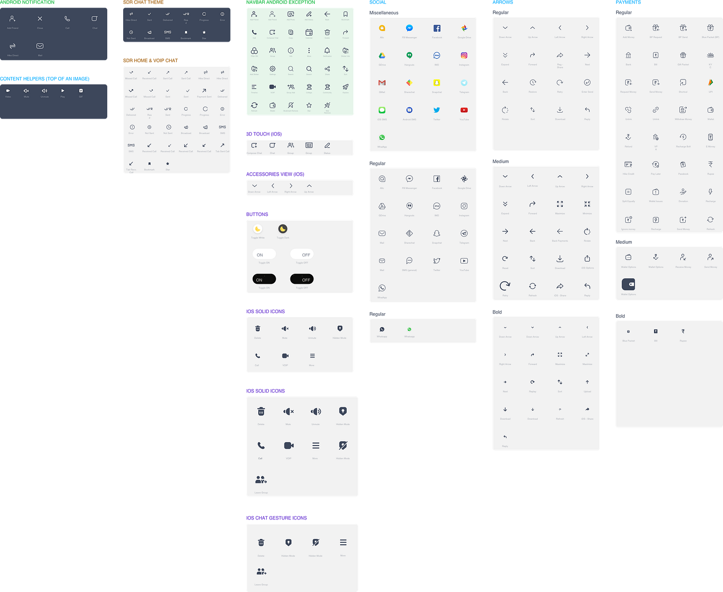
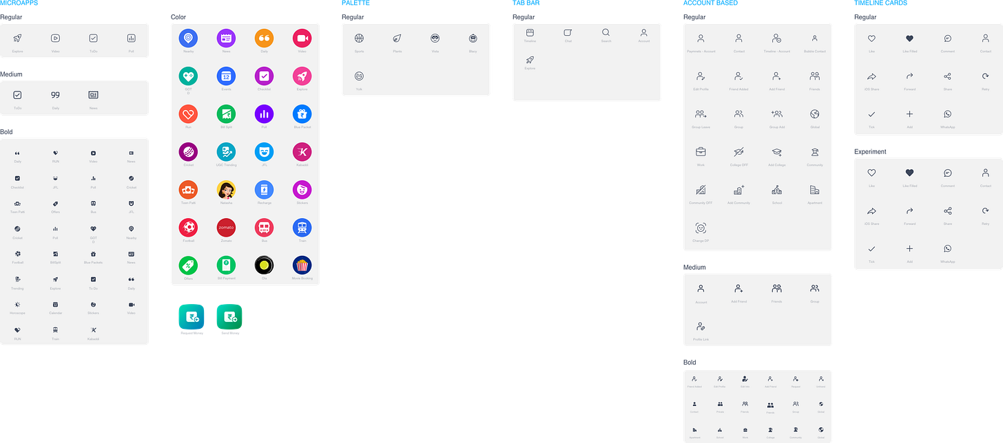
The result was a sprawling icon-set across different weights and types. These icons were rolled to the Android and iOS platform in SVG and PDF formats.
